Brand Element
Colour
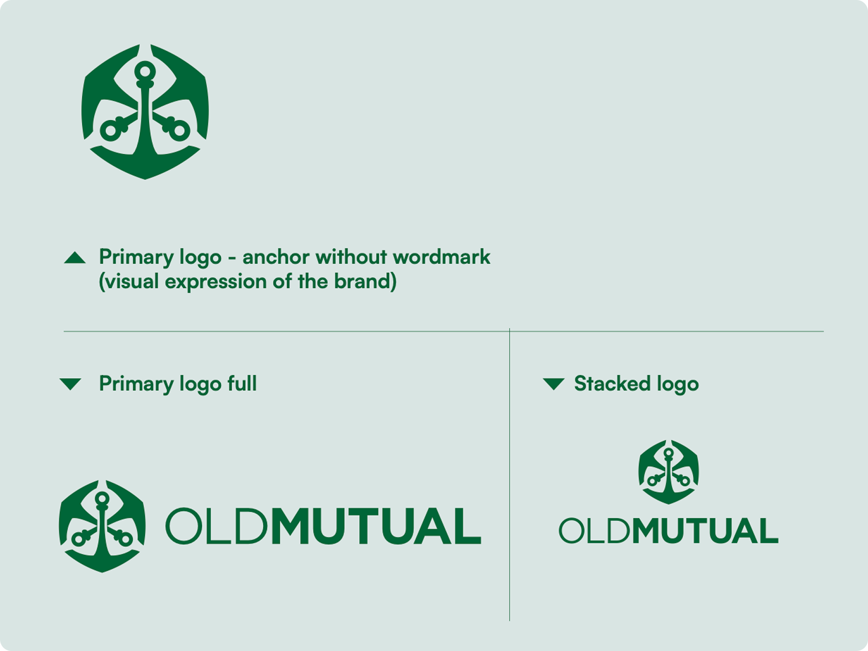
The primary full and stacked logo, is used in some OMAR countries, where the brand is not well known.
When using “Old Mutual” in copy, it must be written as two separate words, have the same weighting, and must be written on one line. It may not go over two lines.
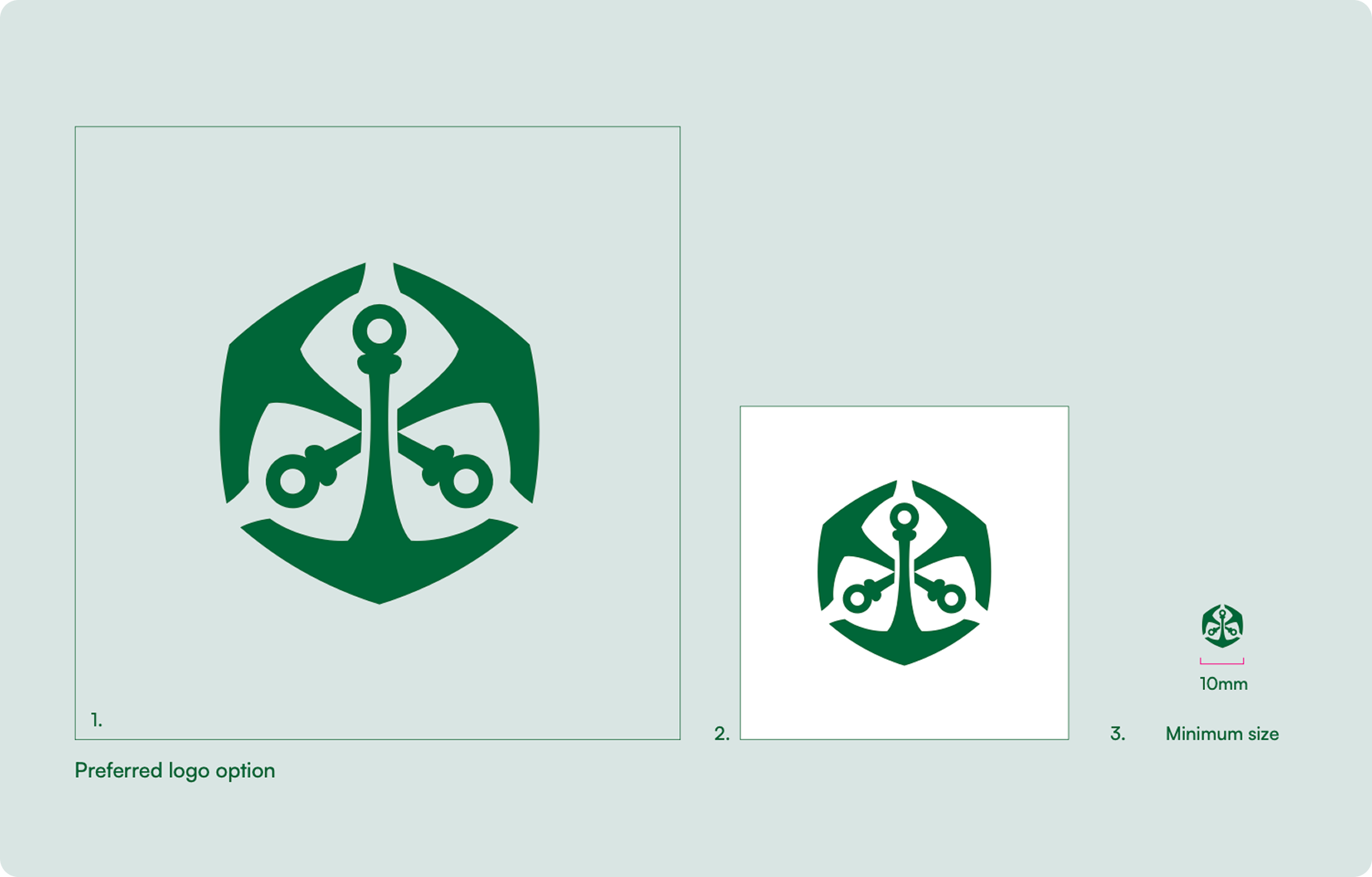
2. When a Breeze background isn’t feasible, place the logo on a white background.
3. The logo minimum size is 10 mm in width for print.
Ensure that there is always clear space equivalent to 50% of the anchor’s height around the logo.
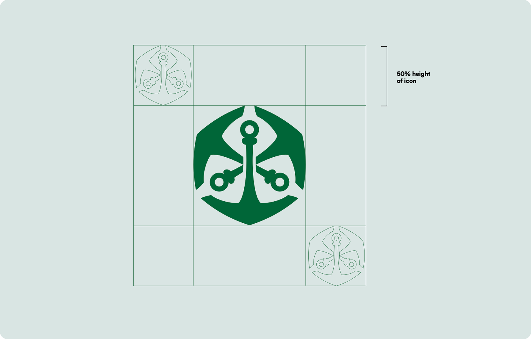
To ensure that our logo stands out on all applications, we have specified the size at which the logo should be placed.
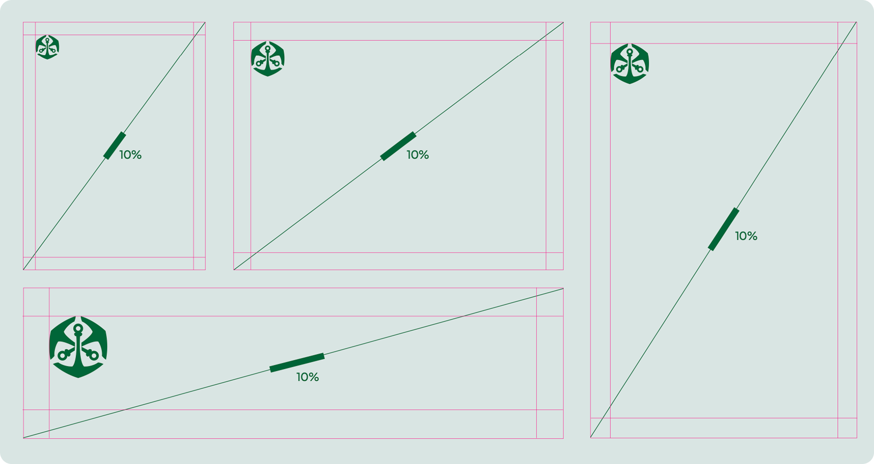
When sizing the logo the following needs to be taken into consideration to achieve consistency on all forms of communication.
The logo needs to be 10% of the diagonal of the layout as shown which can be achieved by drawing a line diagonally from one corner to the opposite corner of a layout.
The margins need to be 50% of the height of the full logo.
For the Out Of Home (OOH) billboards there are different measurements. This is covered in the relevant section.Ensure that there is always clear space equivalent to 50% of the anchor’s height around the logo.
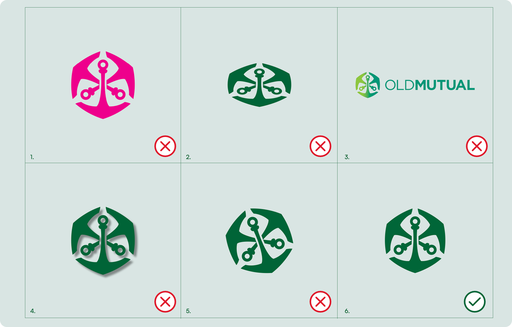
Although there are some guides in place when using the logo the following is not allowed:
1. Do not change the colour
2. Do not stretch or distort the logo.
3. Do not use any other logo variation than the approved logo.
4. Do not add a drop shadow
5. Do not rotate the logo so that the primary anchor is upside down.
6. The Old Mutual logo must consistently be displayed upright, with the bottom anchor directed downwards as illustrated alongside.Ensure that there is always clear space equivalent to 50% of the anchor’s height around the logo.
The Signpost* is a consistent identifier highlighting Old Mutual’s core solutions. This positions
Old Mutual as an Integrated Financial Services provider (IFS) across all touchpoints and reinforces our full offering.
Relevant products and services are grouped under each solution namely Insure | Bank | Invest as part of its category.
Use it with discretion and consistency across all communication, together with the Old Mutual logo.
*Some countries in Africa have a signpost which is slightly different
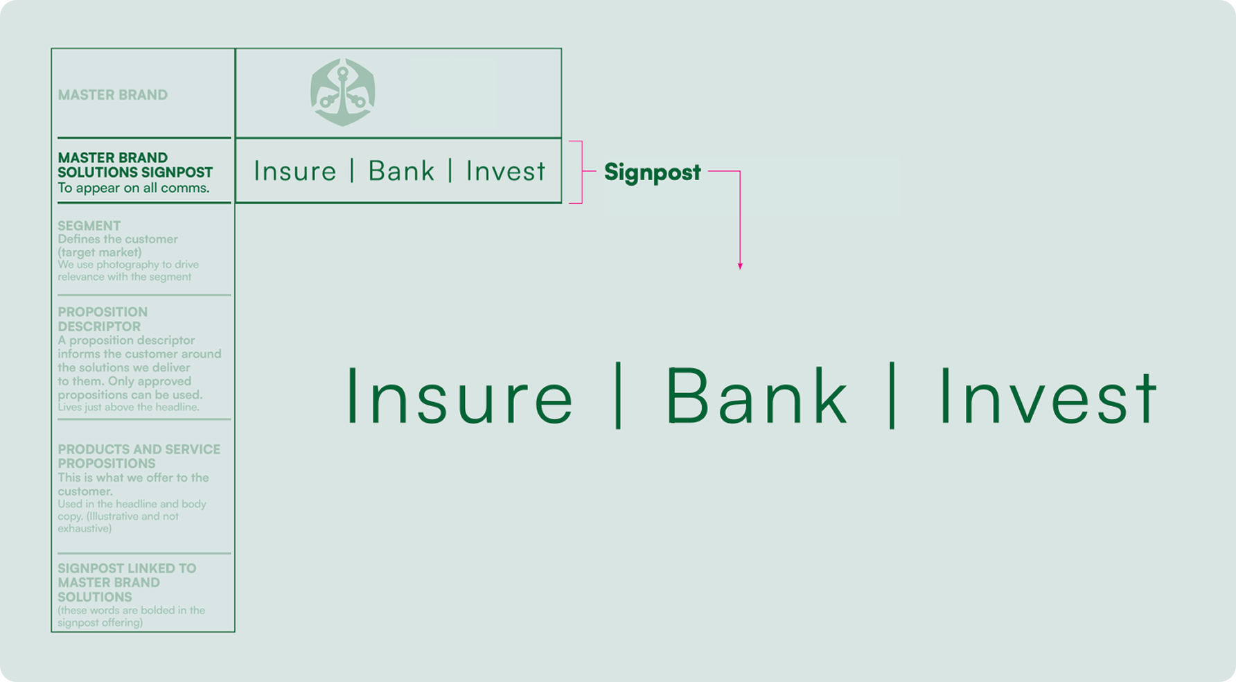
The signpost is constructed using:
• Satoshi Regular for signposting.
• Satoshi Black to highlight an identifier.
• The tracking (space between each letter) is set at 80.
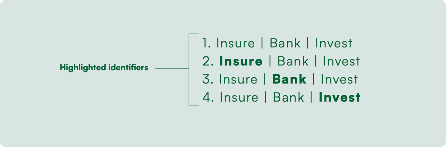
There are four states of highlighted Identifiers:
1. Not highlighted – Non specific communication 2. Insure highlighted – Insurance-related content 3. Bank highlighted – Bank-related content 4.Invest highlighted – Investment-related content
The signpost may NOT be translated into another language.
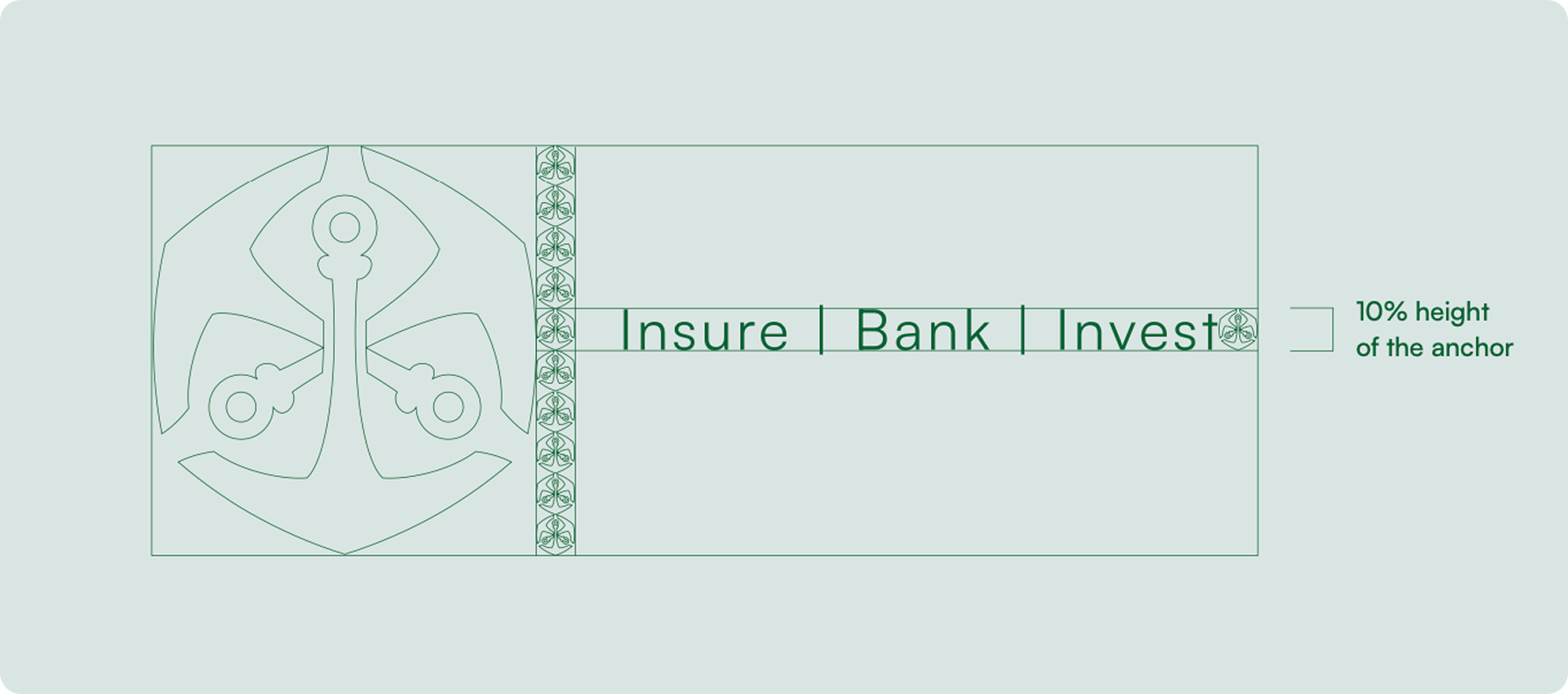
Always ensure that there is clear space around the signpost so that it does not interact with copy and legal line. A clear space of minimum half an anchor in height. This allows it to be visible and separate for customers.
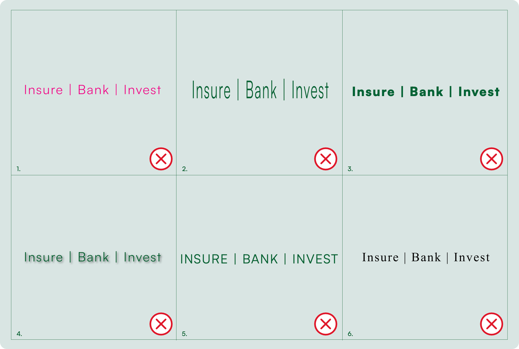
1. Don’t use any other colour besides the specified colour variations.
2. Do not stretch or distort the signposting.
3. Do not use incorrect weighting of signposting
4. Do not use a drop shadow.
5. Do not change the case of the signposting.
6. Do not use any other font than specified.
Old Mutual Brand Line
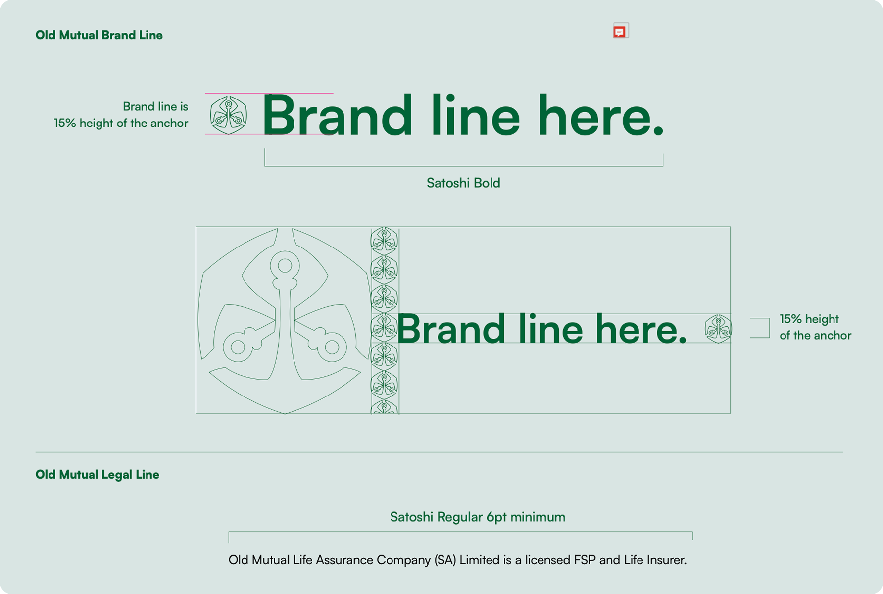
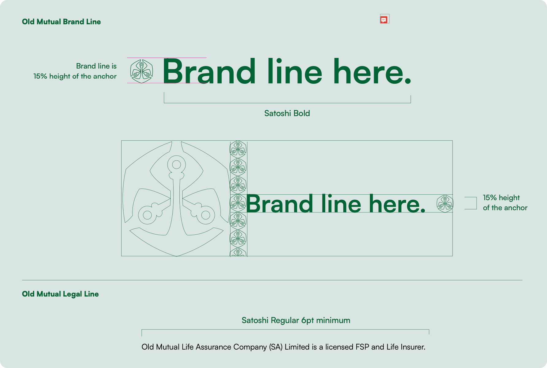
The brand line is Satoshi Bold and is 15% of the logo height.
The brand line is not to be translated.
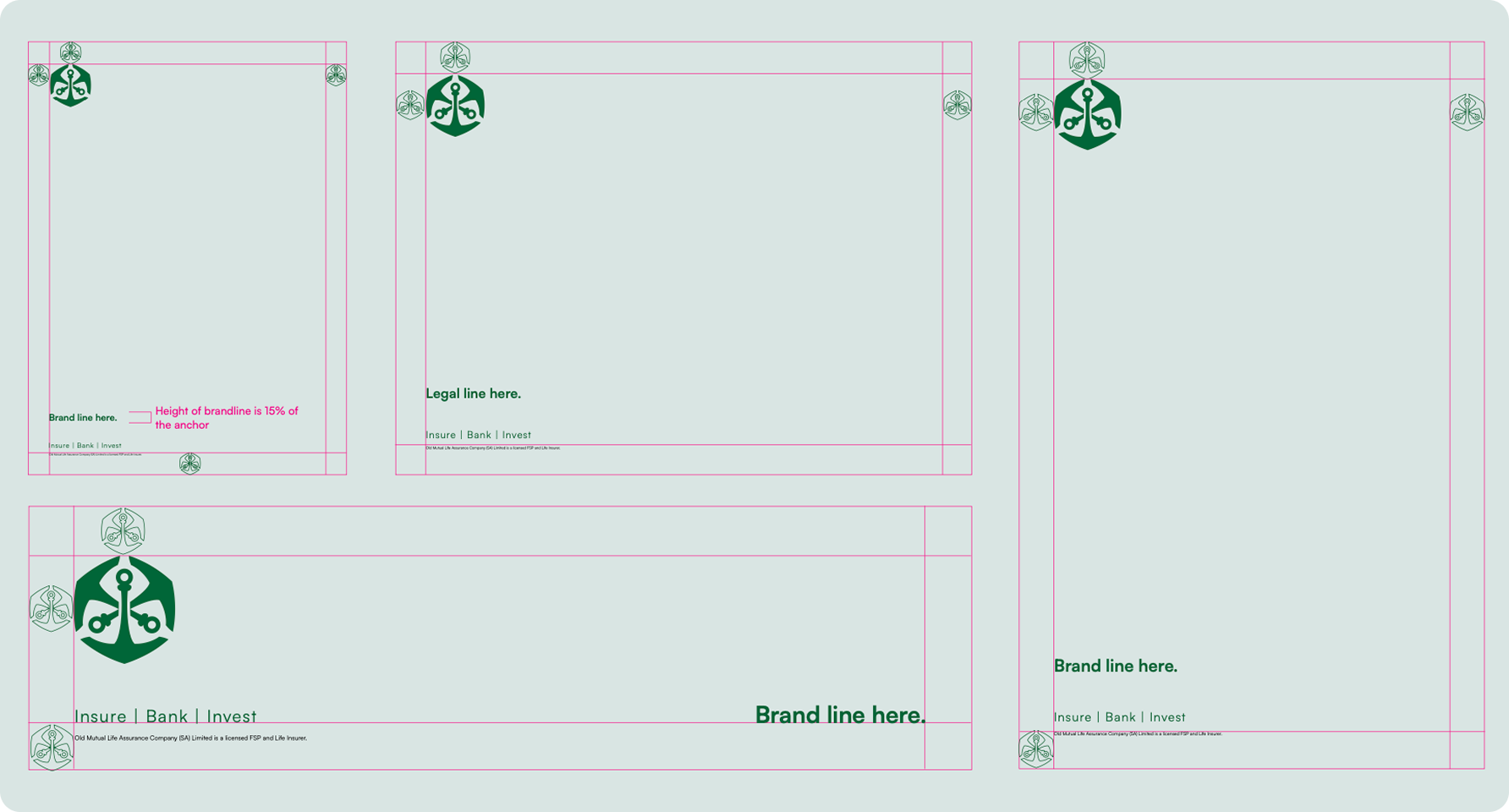
1. Brand line
2. Signpost
3. Legal line
If space is a concern, we then move the brand line to the right hand side, in line with the signpost
The legal line must appear on all marketing and communication material.
The legal line is in Satoshi Regular and should not be smaller than 6 pt in all print communication.
The legal line is not to be translated.
The legal line must always be in black colour font for consistency and legibility.
Legal lines do not appear on promotional material unless legally required. E.g. pull-up banners highlighting proposition or service information.
Legal lines can change. It is the client’s responsibility to make sure they supply the correct one, and they receive legal/compliance sign-off.
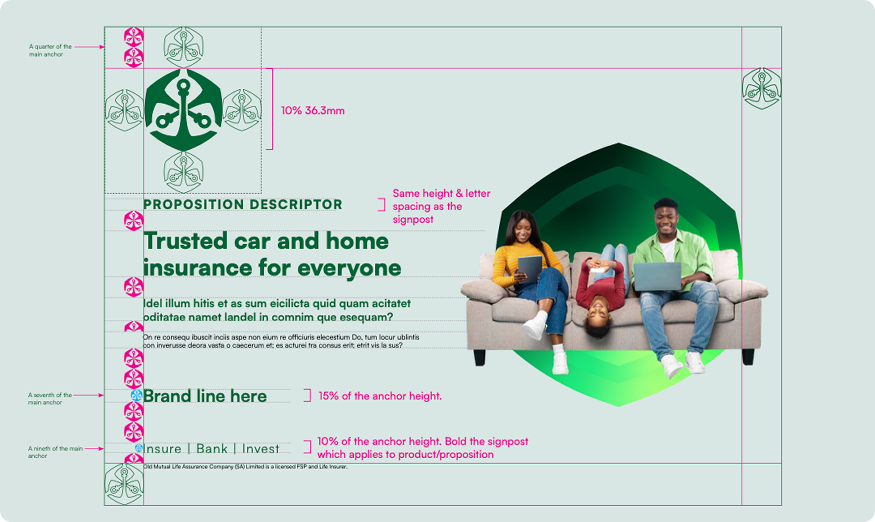
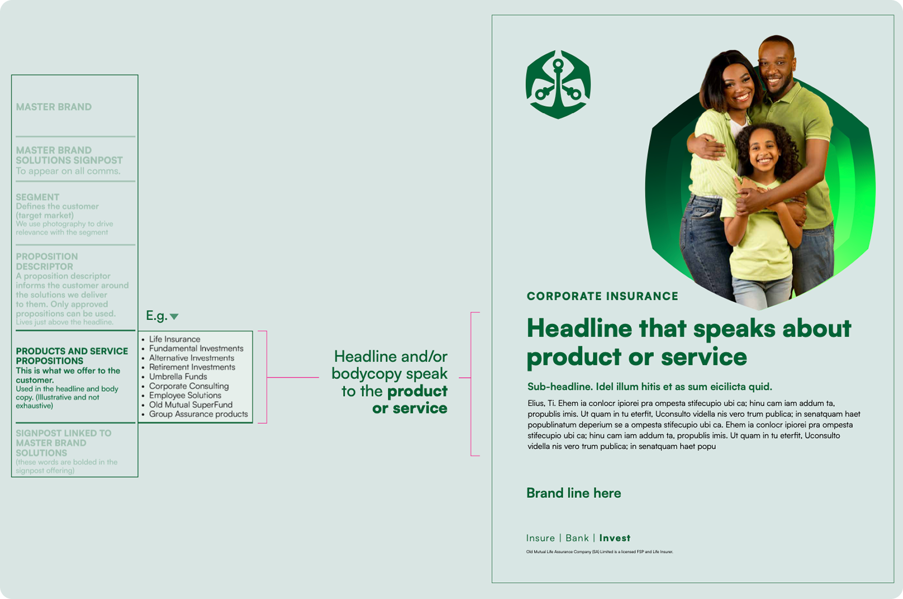
These descriptors must adhere to the placement outlined in the brand architecture, (i.e. above the headline) and may only be used for:
Wealth, Business Solutions, Masisizane, Asset Management, Employee Benefits and Corporate Insurance.
The proposition descriptor is always displayed in UPPERCASE.
The proposition descriptor is constructed like the signpost, using:
– Satoshi Black
– The tracking (space between each letter) is set at 80.

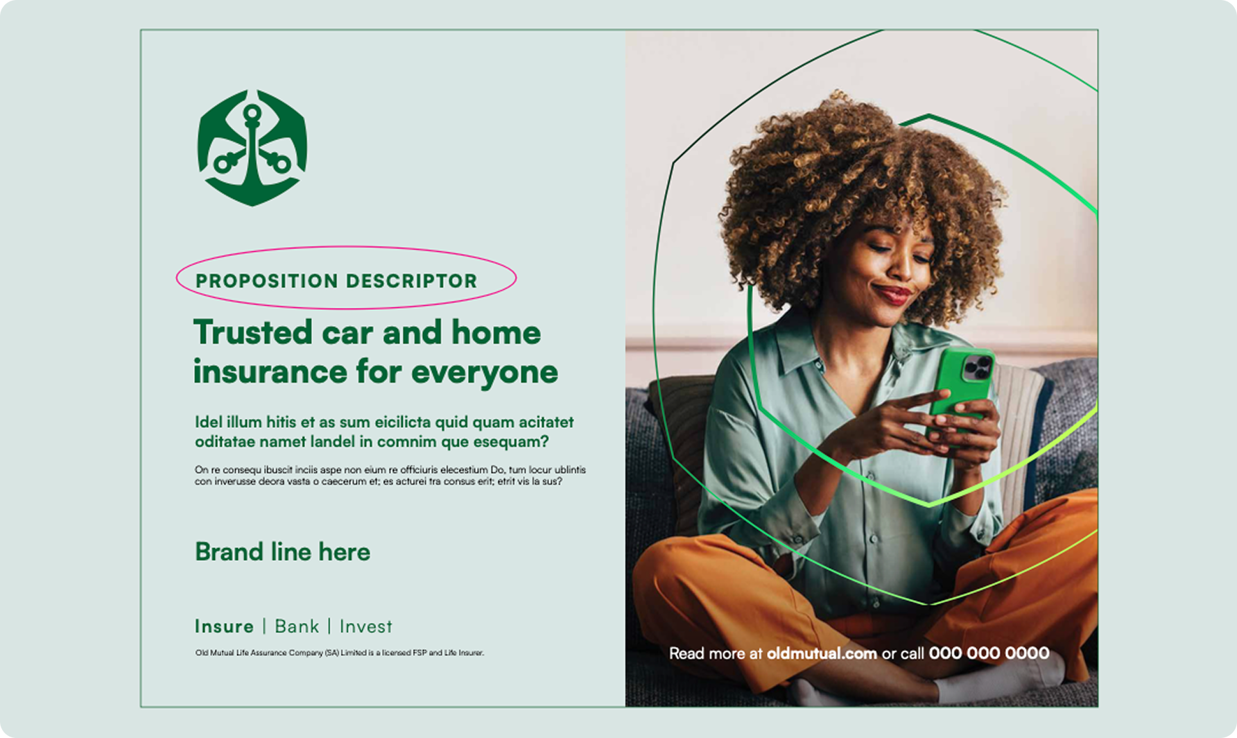
They are featured in either the headline or the body copy, to highlight the key benefits without listing every feature.
Product and service propositions must always be written in sentence case.
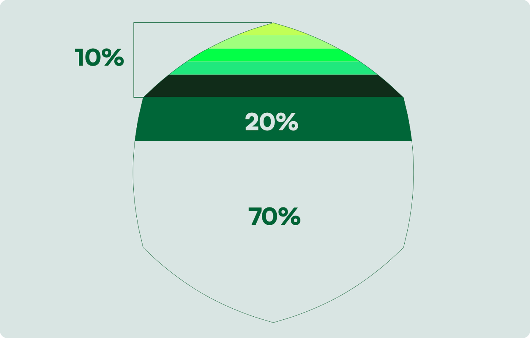
Breeze is the dominant background colour in layouts.
OM Green should be utilised for text and logo colour.
Accent colours should be used sparingly for highlights in copy and digital buttons or prompts.
Please remember: the colours should not be sampled directly from this document, as they may not accurately represent the intended shades. Use CMYK for all print communications. The RGB and HEX codes are only to be used in digital formats.

The primary colour palette for Old Mutual draws inspiration from the iconic OM green.
Breeze is the dominant background colour in layouts.
OM Green should be utilised for text and logo colour.
Accent colours should be used sparingly for highlights in copy and digital buttons or prompts.
Please remember: the colours should not be sampled directly from this document, as they may not accurately represent the intended shades. Use CMYK for all print communications. The RGB and HEX codes are only to be used in digital formats.
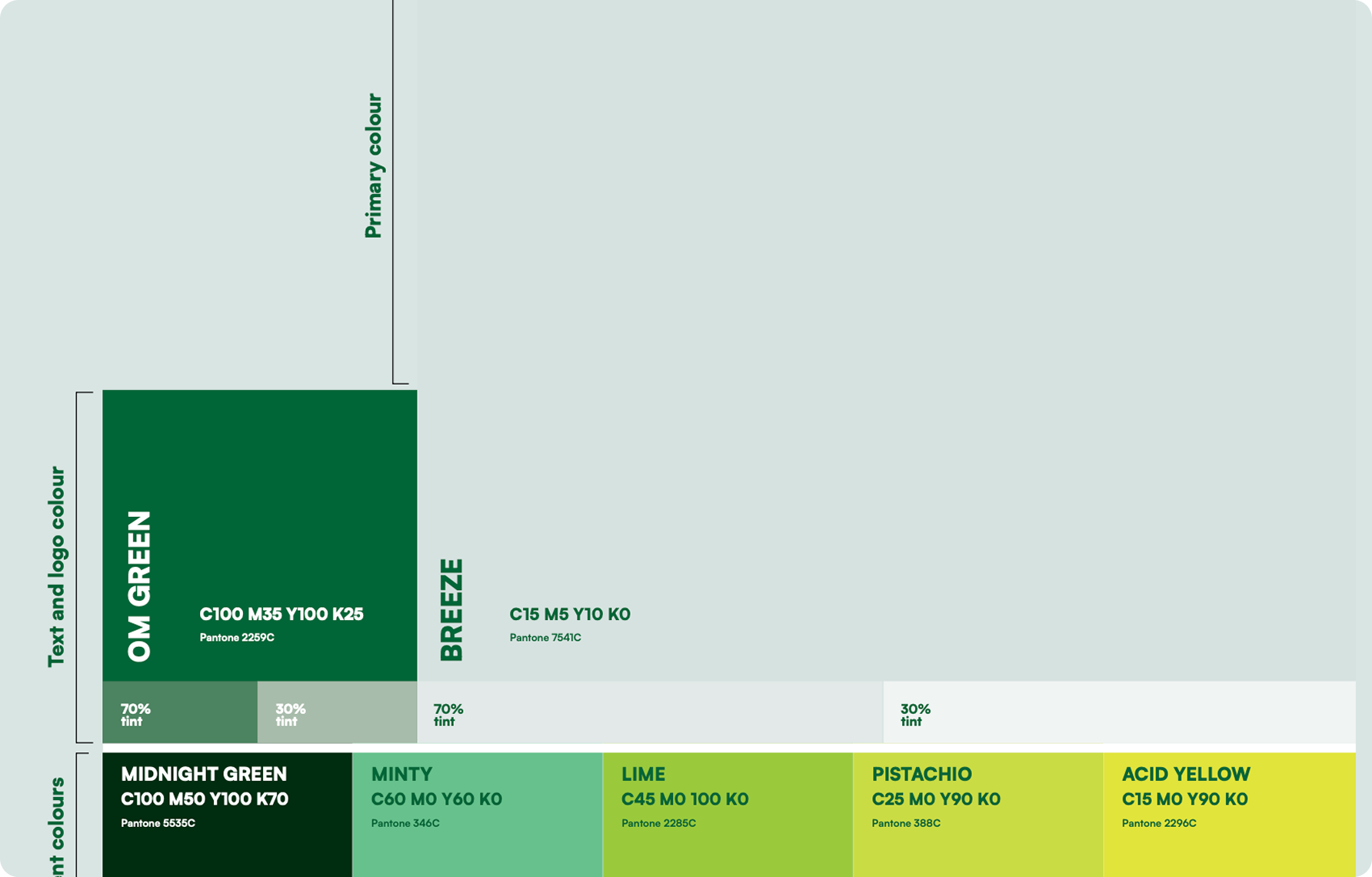
RGB & CMYK Gradient
The Old Mutual gradient consists of the primary colour palette and accent colours, blended seamlessly from dark to light. Shown alongside is how the gradient is created with RGB and CMYK values.
It is important to note that the gradient MAY NOT be created as a linear gradient, as this method does not blend correctly and results in visible lines within the gradient. Instead, it should be used
as a freeform gradient to achieve a smooth and cohesive look.
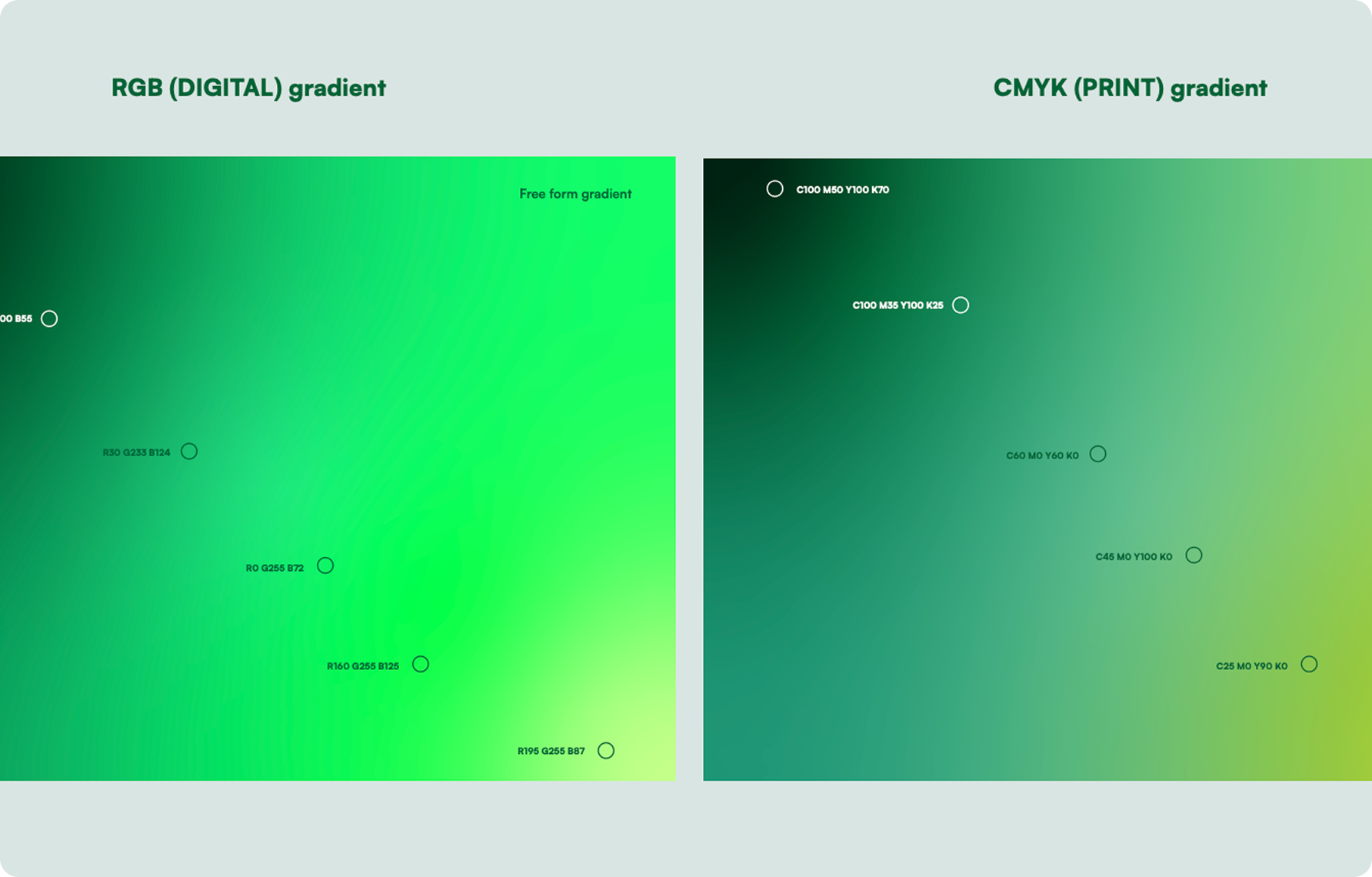
The accompanying visual illustrates how to apply the primary colour palette and gradient, including the recommended proportions for using the primary colours in a layout.
Ratio:
1. Ensure that a minimum of 70% of the layout
features the colour Breeze, which should primarily be used as the background. OM Green should be utilised for text and logo colour.
2. Apply the gradient only inside the background hexagon shape – either filling it completely or following the keyline ripple. Make sure all the colors in the gradient are visible, and don’t change the direction of the gradient.
3. Please note that the accompanying percentages offer guidance on the proper usage of the colour palette to guarantee sufficient representation of the primary colours in all communications.
Tertiary colours are used EXCLUSIVELY for data in graphs and infographics – no other usage is permitted.
Please consult Brand Governance when using the tertiary palette to obtain approval for correct usage before roll out.
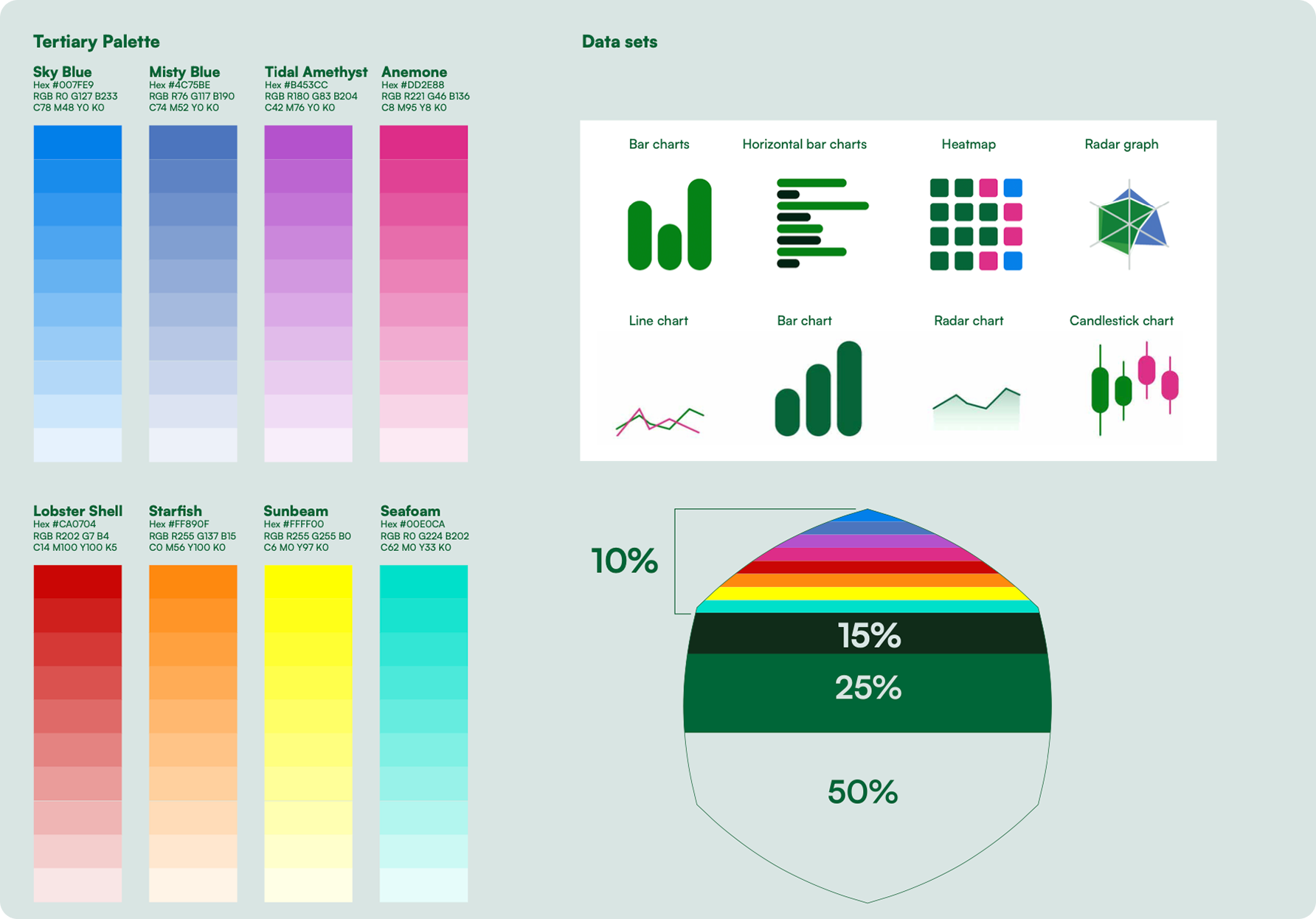
Ratio:
Ensure that at least 70% of the layout uses the colour Breeze, this refers to the majority of the background. No other primary colour may be used as a background except where a full image is being used.
The gradient can be applied within the brand signature (shape) as a full flush or within the ripple. All the colours within the gradient need to be visible.
The rest of the colour palette may be used as highlights within photography.Ratio:
1. Ensure that a minimum of 70% of the layout
features the colour Breeze, which should primarily be used as the background. OM Green should be utilised for text and logo colour.
2. Apply the gradient only inside the background hexagon shape – either filling it completely or following the keyline ripple. Make sure all the colors in the gradient are visible, and don’t change the direction of the gradient.
3. Please note that the accompanying percentages offer guidance on the proper usage of the colour palette to guarantee sufficient representation of the primary colours in all communications.
Images below are used for illustration purposes only.

Communication is predominantly in sentence case. Uppercase is used for the proposition descriptor.
Sentence case is used for the brand line.

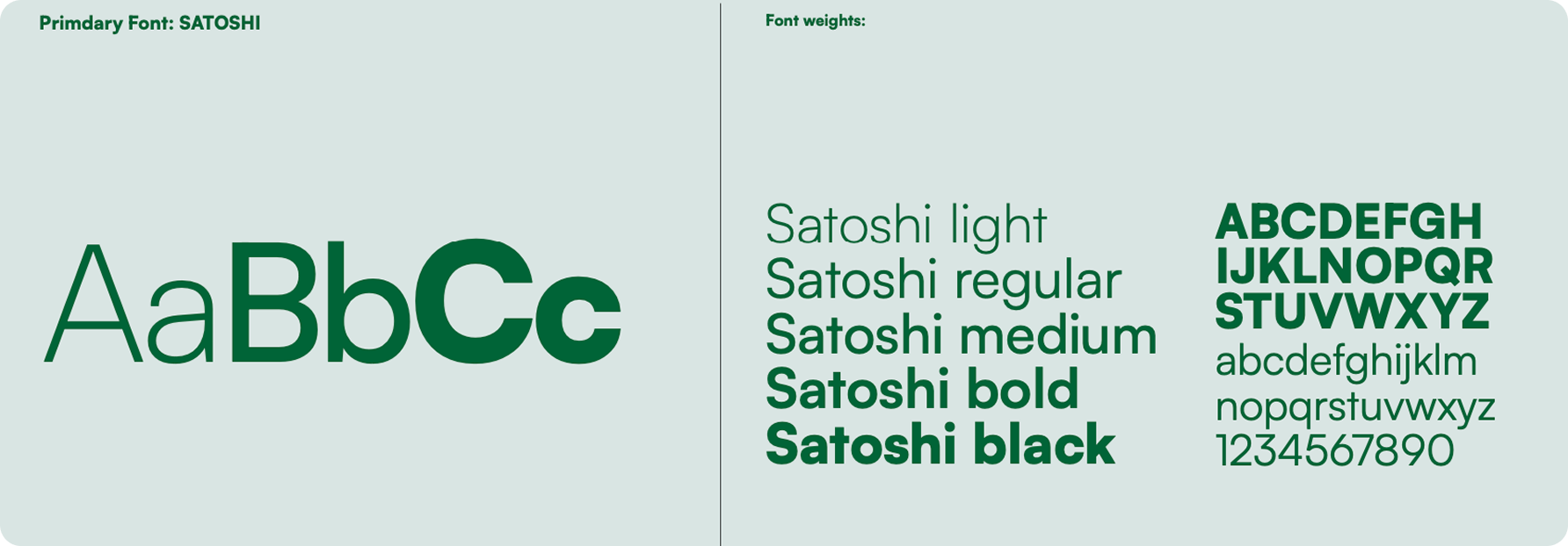
Satoshi is used on all digital touch points across mobile and desktop.
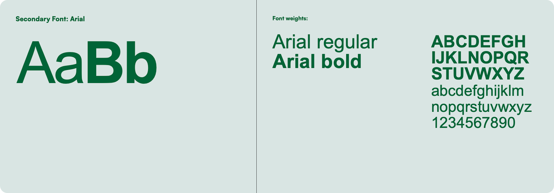
Arial will be utilised for all staff members who use MS Office programmes. Arial will also be used in scenarios where Satoshi cannot be implemented.
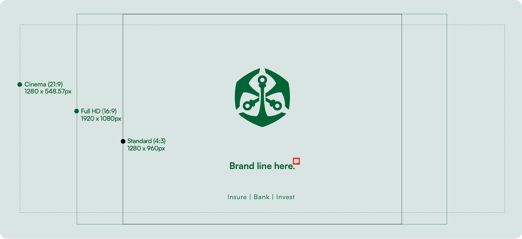
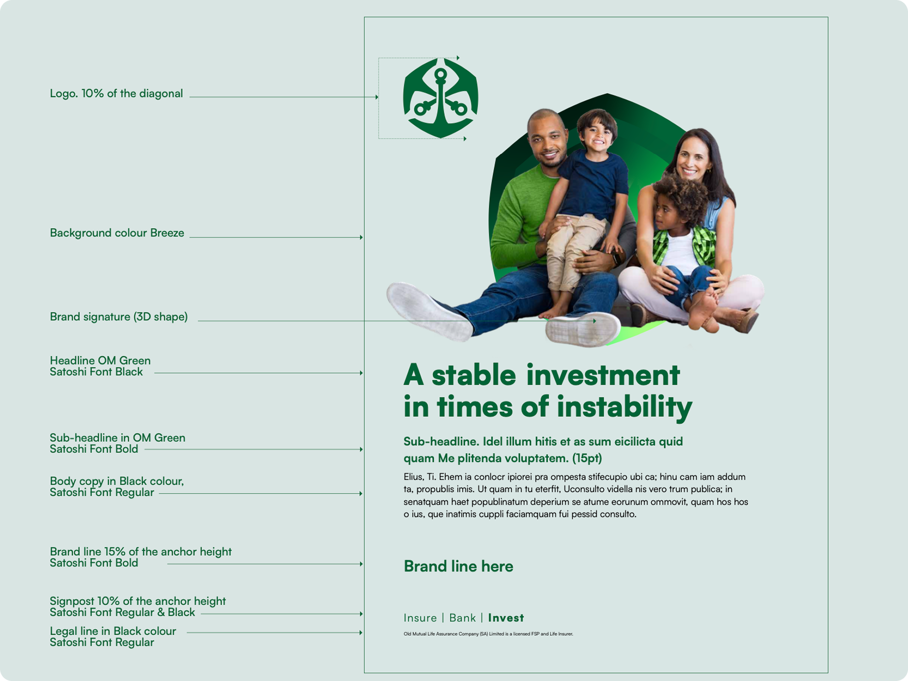
All typography in the layout must always be grouped together as a single element. This approach ensures that the layouts remain simple and cohesive, as demonstrated.
Copy is primarily in sentence case.
All typographical scaling has been specifically sized according to the messaging hierarchy. Please ensure when scaling artwork that the minimum size of fonts for body copy is 8pt.
On headings for BTL, uppercase may be used when absolutely necessary.
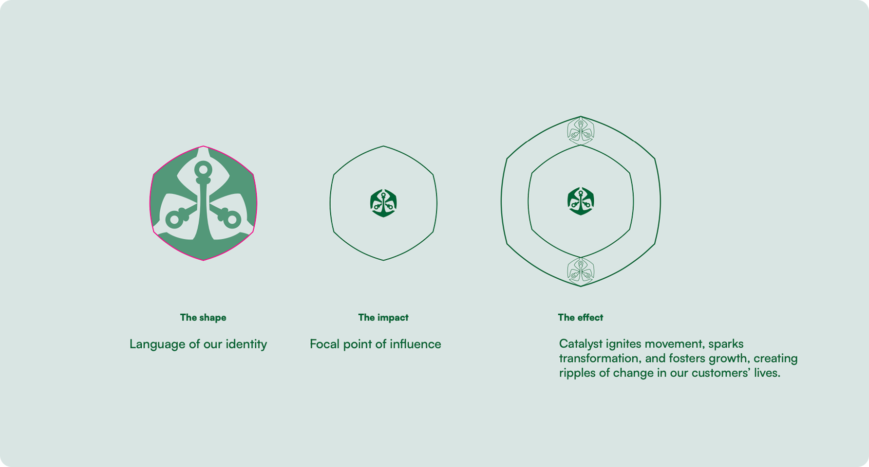
Shown alongside are the four brand characters:
1. Flat 1-colour
2. Flat gradient
3. Ripple
4. 3D gradient
Note:
The shape and gradient direction is fixed, it cannot change direction. I.e.: it cannot be flipped or rotated.
2. Flat gradient
3. Ripple
4. 3D gradient
The shape and gradient direction is fixed, it cannot change direction. I.e.: it cannot be flipped or rotated.

• Ripple
• Flat 1-colour
• Flat gradient
• 3D gradient
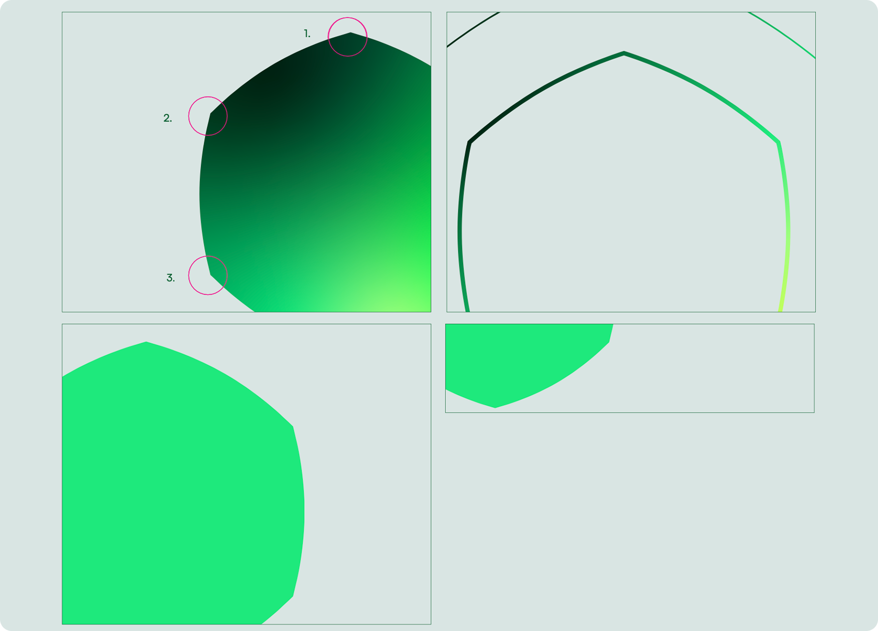
A super-crop is used where maximum use of either photography or type is required. The inner signature needs to have a minimum of two corners visible at all times, three is preferable.
A gradient of the hexagon can be used where an image is required and with text. This can also be super-cropped or used as full.
A flat colour hexagon can be used for a bold typographic statement. This can also be super- cropped or used as full. The flat hexagon
can make use of the gradient or the accent colours: Acid Yellow, Minty, Lime and Pistachio. Allowances are also made where an image can go on top of the flat hexagon, together with type.
There are various 3D ways in which the hexagon can be used. This can be used as a focal point in cut-out photography. It can also be used within a full image where it sits behind the focal point.

Only in special circumstances can one ripple line be used.

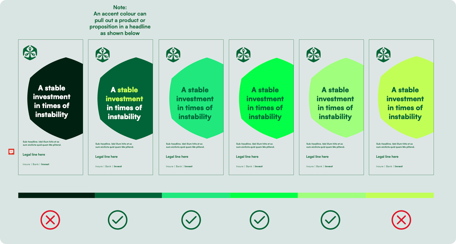
A flat colour hexagon can be used for a bold typographic statement. This can also be super- cropped or used as full. The flat hexagon can use any of the greens with the exception of the midnight green and acid yellow.
On OM Green, an accent colour can be used to make the product or proposition stand out.
The ripple must not be broken, but can include text inside
A gradient of the hexagon can be used where an image is required. This can also be super-cropped or used as full. The flat gradient may also contain text.
A flat 1-colour hexagon can be used for a bold typographic statement. This can also be super-cropped or used as full. The flat hexagon can make use of any of the greens with the exception of the midnight green and acid yellow.
There are various ways in which the hexagon can be used in 3D. This can be used as a focal point in cut-out photography. It can also be used within a full image where it sits behind the focal point.
There are various 3D hexagon shapes which can be used in place of an image in layouts.
A full image can be used in a layout, but they need to include one of the shapes on this layout. The shape needs to interact with the image and needs to enhance the focal point of the image.

The relevant target audience should also be able to relate to/identify with the selected images.
(This is important for instances of cross cultural image selection. E,g. we can’t be diverse in orientation in countries where certain orientations or the practices associated with them are illegal)

Material icons are delightful, beautifully crafted symbols for common actions and items. Download on desktop to use them in your digital products for Android, iOS, and web.


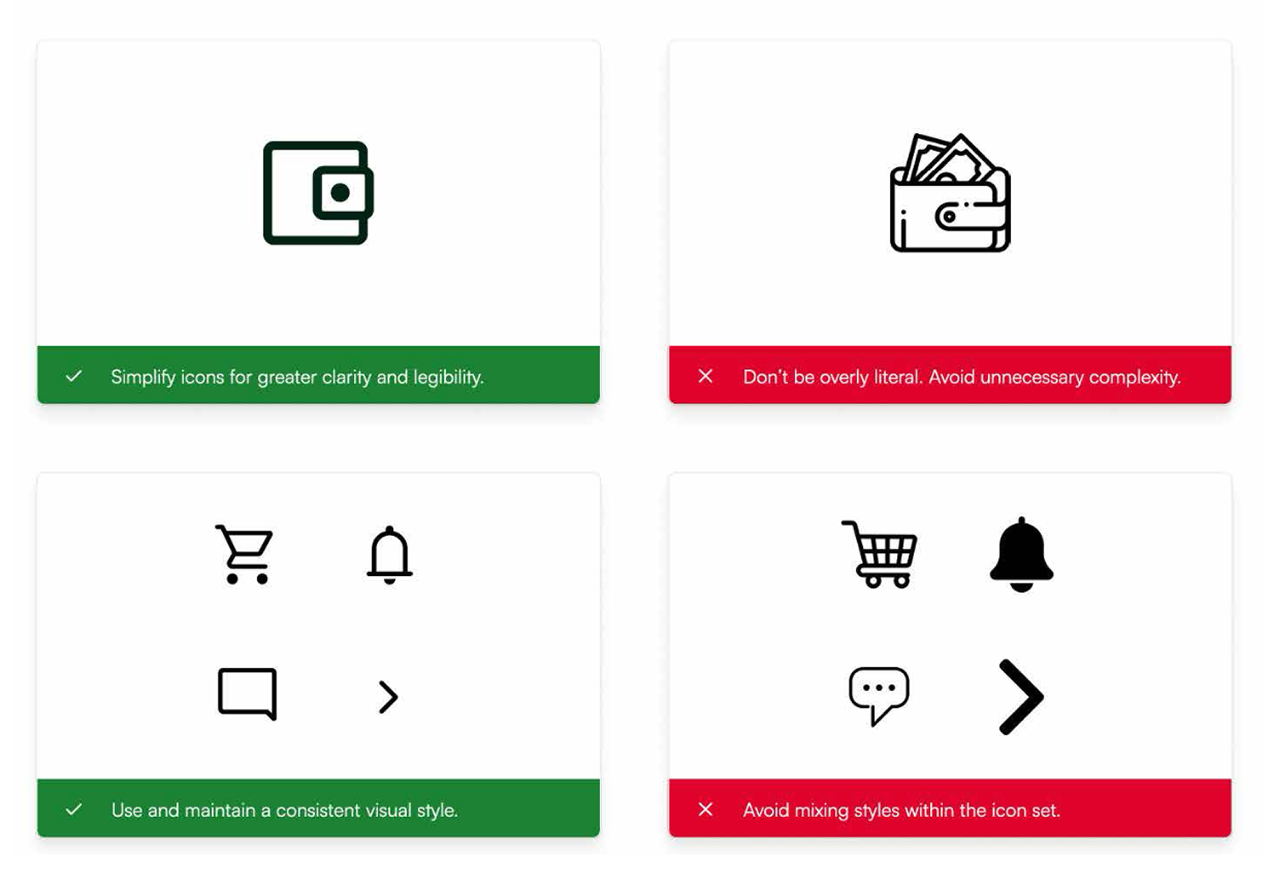
Design Principles: If a custom icon needs to be designed, use the following principles.
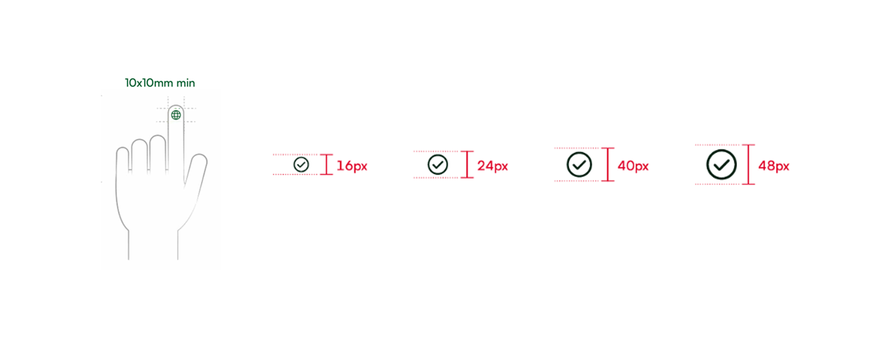
for finger pads are between 10–14mm and fingertips are 8–10mm. This makes 10mm x 10mm a good minimum touch target size for touch screen devices.
Icon Properties:
Standard icons are displayed as 24 x 24px (digital), but the following sizes may also be applied when relevant.